Choosing the right color palette is an essential aspect of design, whether for home interiors, fashion, or branding. Color choices can significantly impact mood, perception, and even behavior. By understanding the science behind color, one can create harmonious and effective palettes that resonate with the intended audience or purpose. This exploration into color choices delves into various aspects that influence how colors are perceived and how they can be strategically used to achieve desired outcomes.
The Psychology of Color
Color psychology examines how different hues affect emotions and behaviors. For instance, blue is often associated with calmness and trust, making it a popular choice for corporate environments. Red, on the other hand, is linked to excitement and energy, frequently used in marketing to grab attention. Understanding these associations can guide the selection of colors that align with the intended message or atmosphere. Designers often use color psychology to evoke specific feelings or reactions, tailoring their palettes to fit the context of their project.
The Role of Cultural Influences
Cultural background plays a significant role in color perception. Colors can have different meanings and associations across cultures. For example, white is often seen as a symbol of purity in Western cultures, while in some Eastern cultures, it is associated with mourning. Being aware of these cultural nuances is crucial, especially in global projects or multicultural settings. Designers must consider the cultural context to ensure that their color choices are appropriate and resonate with the target audience.
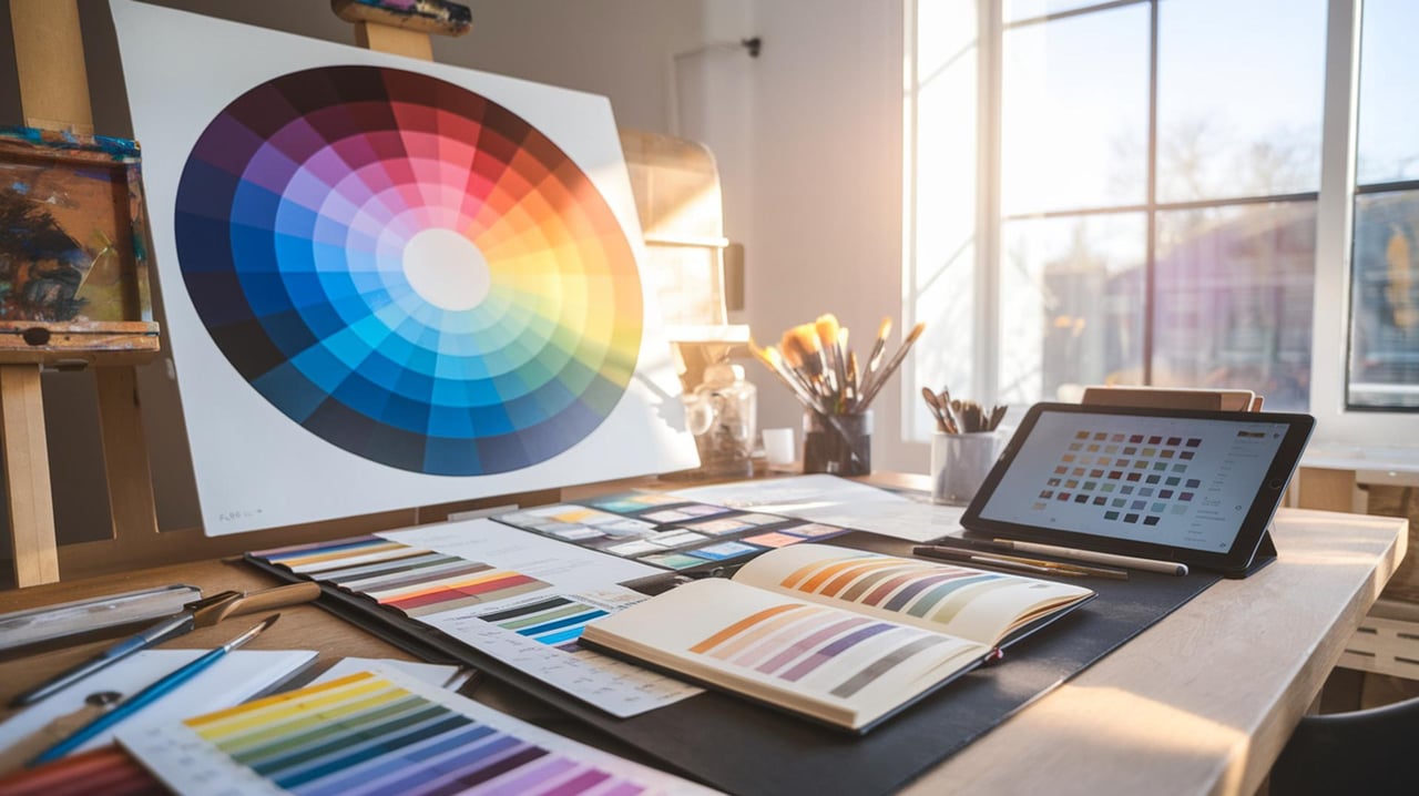
The Science of Color Harmony
Color harmony refers to the aesthetically pleasing arrangement of colors. It is based on the color wheel, which organizes colors in a way that shows their relationships. Complementary colors, which are opposite each other on the wheel, create high contrast and vibrant looks. Analogous colors, which are next to each other, offer a more harmonious and serene appearance. Understanding these principles helps in creating balanced and visually appealing palettes that enhance the overall design.
The Impact of Light on Color Perception
Lighting conditions can dramatically alter how colors are perceived. Natural light, fluorescent light, and incandescent light each have different effects on color appearance. For instance, a color that looks vibrant in natural daylight may appear dull under artificial lighting. Designers must consider the lighting environment where their color palette will be viewed to ensure consistency and accuracy. Testing colors in various lighting conditions can prevent unexpected surprises and ensure the desired effect is achieved.
The Use of Color in Branding
In branding, color is a powerful tool for creating identity and recognition. Brands often use specific colors to convey their values and connect with their audience. For example, green is commonly associated with eco-friendly products, while black can denote luxury and sophistication. Selecting the right colors for branding requires an understanding of the brand's message and the psychological impact of colors. Consistency in color use across all brand materials helps in building a strong and recognizable brand identity.
The Influence of Trends on Color Choices
Color trends can influence design choices across various industries. These trends often reflect societal shifts, technological advancements, or cultural movements. Staying updated with color trends can provide inspiration and ensure that designs feel current and relevant. However, it's important to balance trendiness with timelessness, ensuring that color choices remain effective and appealing over time. Designers can incorporate trendy colors in a way that complements the overall design without overwhelming it.
The Role of Personal Preference
Personal preference plays a significant role in color selection, especially in personal spaces like home interiors. While scientific principles and trends provide guidance, individual tastes ultimately shape the final color palette. Personal experiences, memories, and emotions associated with certain colors can influence preferences. Designers often work closely with clients to understand their preferences and incorporate them into the design, ensuring a personalized and satisfying result.
The Importance of Testing and Iteration
Testing and iteration are crucial steps in the color selection process. Colors can look different in practice than they do in theory, so it's important to test them in the actual environment where they will be used. This might involve creating samples or mock-ups to see how colors interact with each other and with other design elements. Iteration allows for adjustments and refinements, ensuring that the final palette achieves the desired effect and meets the project's goals.
The Integration of Technology in Color Selection
Technology has revolutionized the way colors are selected and applied in design. Digital tools and software offer a wide range of features for exploring and testing color palettes. These tools can simulate different lighting conditions, suggest harmonious color combinations, and even analyze the psychological impact of color choices. Leveraging technology can enhance the efficiency and accuracy of the color selection process, providing designers with valuable insights and options.
The Balance Between Functionality and Aesthetics
Balancing functionality and aesthetics is key to successful color selection. While colors should be visually appealing, they must also serve the functional needs of the design. For example, in a workspace, colors should promote focus and productivity, while in a retail environment, they should encourage browsing and purchasing. Designers must consider both the aesthetic and practical implications of their color choices, ensuring that they enhance the overall user experience.
Discover Your Perfect Palette
Choosing the right colors for your home can make all the difference in creating a space that feels just right. With science-backed insights, you can confidently select palettes that enhance your living environment. Whether you're refreshing a single room or redesigning your entire home, the right colors can transform your space. For personalized advice and expert guidance, reach out to The Jamie Bechtold Group today.